Friday, 28 March 2014

Interior Landscape: Perspective and Composition

This is an interior architecture landscape image. The theme of perspective is prevalent here as we see from this vantage point we are looking down the building towards the vanishing point, the pillar to left give us a good example of foreshortening as from here we have a two point perspective which allows the shape of it to gives us a real sense of depth in the image. The angle of the floor tiles is distorted due to their progression into the distance. As well as this both the actual lines of the walls and the implied lines of the windows show the orthogonal lines in this image. The horizon line isn’t entirely clear but is roughly somewhere in the centre between the two central bridges.

The picture is very much divided between foreground and background. In the foreground there are many areas of interest such as the pillars; the elephant’s rear; the dark corner to the left and the surrounding walls; the darkened sign and the handrail going across. The darkened sign and large elephant exhibit to the right are balanced out on the page by the dark pillars and darkened corner on the left hand side. 

Wednesday, 19 March 2014

Landscape: Interior

One area of interest is the bar across the page, which shows very strong foreshortening as it travels across the page. Another area of interest is the bar holding it up to the bottom left of the page, the darker tone and the detail on it bring more focus to it. It’s also at an interesting angle as two sides of it are visible. Similarly another area of interest, the rectangular cage of the lift which is also darker and more detailed and likewise has two-point perspective on it. 

Another interesting quality this picture has is a very high use of the rule of thirds. The lift cage shows one line, while the top edge of the top floor railing shows a horizontal line. The close-by bar roughly travels along to other horizontal line, likewise the pillar at the end of it helps create the implication of the other vertical along with the feet. The different areas of the image roughly fit within the thirds. One significant point of interest and perhaps the focal point is at the meeting of the bar with the pillar although as they create a point the focal point could arguably be the head of the human figure, as the lines point to him. 

Foreshortening: Nature

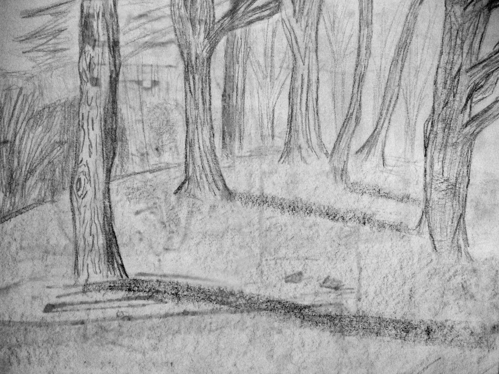
This nature landscape focuses on the use of perception of curves with an emphasis on the way depth can be given through differences between the foreground and the background of the picture. The more detailed darker front most tree greatly differs from the simplified lighter impressions of the trees to the top right  these trees are less detailed and appear further away, thus the impression of depth is given. The curve of the hillside as seen from this perspective allows us to see the trees shrinking and fading as we look further into the distance. The image would be quite unbalanced if it were not for the shadows of the trees and the lines of the curve of the landscape pulling the eye to the right side of the page,  without this the front tree would create unbalanced focus. Even the front most trees branches stretch to the right adding to this point right. Also the implied line of the trees, curving towards the busier distance of the upper right corner draws focus away from the front tree where focus begins. The shadow to the bottom right corner balances out the buildings and trees to the top right improving the pictures composition. 

Landscape: Nature

This piece is a landscape of a natural setting. There is a lot of use of line in this image, the lines both of the trees themselves and the lines on the tree bark that give it the sense of texture it has; then also the lines of the shadows the trees are casting and even the darkened shadow line on the front tree. There is also an implied line created by the trees themselves, this implied line is curved and line the line to the background curves around the hill gradually. The line of the background curve takes you to the horizon line at the base of the faded background trees. You can see that the piece is draw from uphill as the shadows are caste diagonally sloping down the hill. You can see the further off  trees are might lighter than the closer ones causing the sense of distance as well as the detail such as the circular patterns on the front tree not to mention the shadow. While the front tree and its shadow are definitely areas of interest there’s no obvious focal point for the image.

Monday, 10 February 2014

Non-Human Anatomy

These are some of the images that looked at the anatomy of animals considering their bones, fat and muscular structures as see from different angles.
This angle of the sea lion allows us to see both the round curve of the body and the leaner neck and smaller head. The darkening of the underneath combines with the curve of the back to give a sense of the roundness of it and the loose makes used to make the flippers reflect the more agile nature of them.

The perspective on the bat is interesting as while one wing is entirely revealed in shape almost looking down on at it, the other smaller and less shapely due to foreshortening on this image. The contrast of the soft fur of the bat and the leathery wings is reflected in the choice of mark types made by the graphite.
The stage skeleton is a quick pen image that from the angle of looking just slightly up at it gives it a real noble sense. The detail of the knee joints and the impression of the spine and rib cage show the attention t anatomy. Notice the angle of the body looking off to the left and how this angle is reflected in the antlers.

Saturday, 8 February 2014

Movement

These three images are from part of a movement study where each has been drawn over the other to create the sense of movement. 
Even amongst the chaos some of the structure of the anatomy can be clearly see. The knees in the folded leg position on image one, the arch of the back and the head leant over and the internal structures of many of the knees and shoulders. The arm and shoulder on the furthest right pose gives the impression of muscular external structures even if not entirely accurate. 

 
Image two has the figure stretching as the final pose with a foreshortening used on the arms.This figure switches between internal and external structures for the different poses based on what was most prominent and seemed most important to convey each, though some like the final pose show both, particularly notably the spine. 
Image three also shows some good structure, the impression of the muscles on the shoulder on the right; the impression of the gastrocnemial muscles can be seen. Proportionally image three is inaccurate but all three give the impression on movement quite successfully, the dark tone of them makes it more difficult to differentiate between figures, but aesthetically it makes the pieces more interesting

Saturday, 1 February 2014

Human Anatomy: Muscles

For this image I focused on the muscular accuracy and looked at the distinct shapes of each component of the body. An area of interest in this image is the gluteus  as its one of the most visible areas of the body here we see the round shape of it exaggerated by the curve of the lines on the lower back, while itself it is kept fairly clear of lines. The back itself is curved forward as show by the spine, although the thickness of the back is again given away by the curve of the lines across the back. The top leg is foreshortened as it is bent away. The inner crease of the knee as well as the area that shifts between gluteus and leg has been darkened to imply the shape of the muscles. The muscles of the lower leg and the foot are somewhat distorted by the angle of the view point but are still visibly there. Also notice the attention to the foot visible underneath the top leg and see the implied bend in the leg that is out of view. The visible shoulder and arm are also curved to imitate the muscles of the figure.